 Blogging Heros
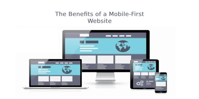
With 27% of small businesses with no website in 2022, you should stay updated as a business owner. In our ever-changing digital world, staying ahead of the curve and keeping up with the times is essential. You can create a mobile-first website to accomplish that!
It helps provide a great user experience and keeps visitors coming back for more. It will help empower your business and give you the competitive edge you need! Provide your visitors with a streamlined experience and allow them to engage with your brand on their terms.
Take advantage and learn the benefits of the right website and get ahead of the competition! So, keep reading!

Become Responsive to Customers
With more people accessing websites from their mobile devices, having a mobile version would be best. The right website design can provide visitors with the best experience.
Mobile-first websites are designed for mobile screens. It ensures customers have access to the same features, content, and experiences no matter where they’re accessing it from.
Make sure to design your website to make it easier to provide a consistent user experience across multiple devices and platforms. These factors add up to happier customers and more conversions.
Proper Search Engine Optimization
Mobile-first websites emphasize delivering content and user experience optimized for mobile devices. From an SEO perspective, a mobile-accessible website ranks higher in search rankings than those that need to be mobile-friendly.
With the right website guide, you can design pages with proper optimization.
Fewer Bugs
Reduce the likelihood of bugs developing with a website that is easy to access through mobile devices. When creating a website, search for an excellent website guide. Ensure that the mobile view comes first and that the desktop view should be optimized afterward.
It helps reduce the number of errors that can occur when scaling up the design from small devices to large ones. It also makes development more efficient.
Look for great website tips that you can use as a developer. Focus on a single mobile-friendly design, then a sound software testing plan. It will help ensure that fewer bugs need to be fixed.
Easier Navigation
A mobile-first website allows more straightforward navigation for users on any device. It’s perfect for anyone browsing from their phones. It is designed to fit any screen size, offering a smooth user experience. Preventing users from becoming overwhelmed can help drive them closer to their goals!
The well-crafted touches of minimalism and the effort to reduce unnecessary visual clutter would be best for website management for small business. It lets users access relevant information with collapsible menus and visible calls to action. It also considers a distinct touch interface that requires less physical effort.
Consider a Mobile-First Website for Better Customer Experience
From elevated user experience to improved search engine rankings, a mobile-first website is excellent! Unleash its power to galvanize your business into a success.
The implementation of a mobile-friendly website is reliable and efficient. Leverage its potential, and take advantage of this incredible opportunity to make your business more successful! Try it today and experience the performance and efficiencies associated with this way of doing business. Do you now have a better understanding of mobile-first websites? Visit our blog for more helpful content.